 QQPlotter
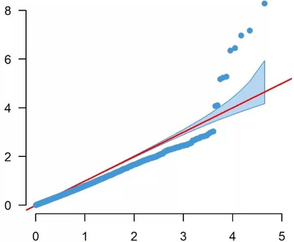
It has become standard to present the GWAS p-values as quantile-quantile (QQ). In a QQ plot, the observed p-values for each SNP are sorted from largest to the smallest are plotted against the expected p-values from the null hypothesis. The null hypothesis states that there are no causal SNPs in the GWAS, therefore the observed p-values correspond to the expected p-values resulting in all points being on or near the diagonal line between the x-axis and the y-axis. If there are causal SNPs in the GWAS, then the QQ plot will look like a line with a “tail” at the higher p-values range. This is due to some observed p-values being more significant than expected under the null hypothesis. The QQ plot can also be used to detect problems. For instance, if there are many more significant SNPs associated with the phenotype than expected under the null hypothesis, you will see an early separation between the observed and expected p-values.